Unlocking The Power of Visualized Website Traffic: A Bird's Eye View with Flowpoint
Imagine you're flying above a bustling city. Skyscrapers touch the sky, cars zoom past, and people go about their day. From up here, you can see the paths they take, where they cluster, and which places are hotspots. Now, think of your website as this city, and each visitor as a person navigating through it. Just as an aerial view provides insights into a city's activity, visualizing website traffic grants an unparalleled perspective on user behaviour.
The Magic of Top User Flows
At the heart of every successful website lies understanding. Knowing which pages are goldmines and which are mere stopovers can be the difference between thriving and just surviving.
For instance, let's say you run an online toy store. You've got a page dedicated to stuffed animals that isn't doing as well as expected. Through visualizing your user flows, you notice that users tend to stop at the action figures page before exiting. What's happening? Is the next link hard to find? Are the images not loading properly? These are the questions you can begin to answer.
And it doesn't end there. Knowing the source of this traffic helps tailor strategies. If most users are from a particular blog post or social media platform, then enhancing those channels becomes pivotal.
Why Visual Over Lists and Numbers?
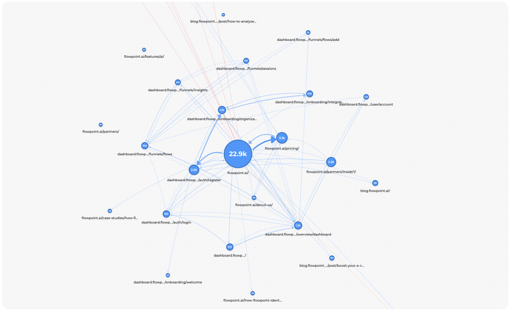
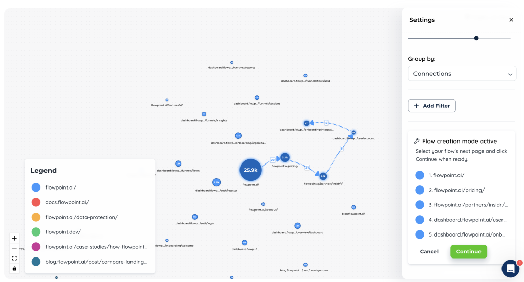
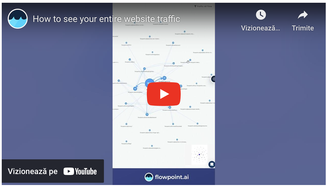
Looking at the image from Flowpoint, you'll notice nodes and connecting lines. This isn't just a beautiful constellation; it's an intuitive representation of website traffic. At a single glance, you can understand which pages are most visited, the paths taken, and where users drop off.
Beyond Just Views: Conversion Funnels and More
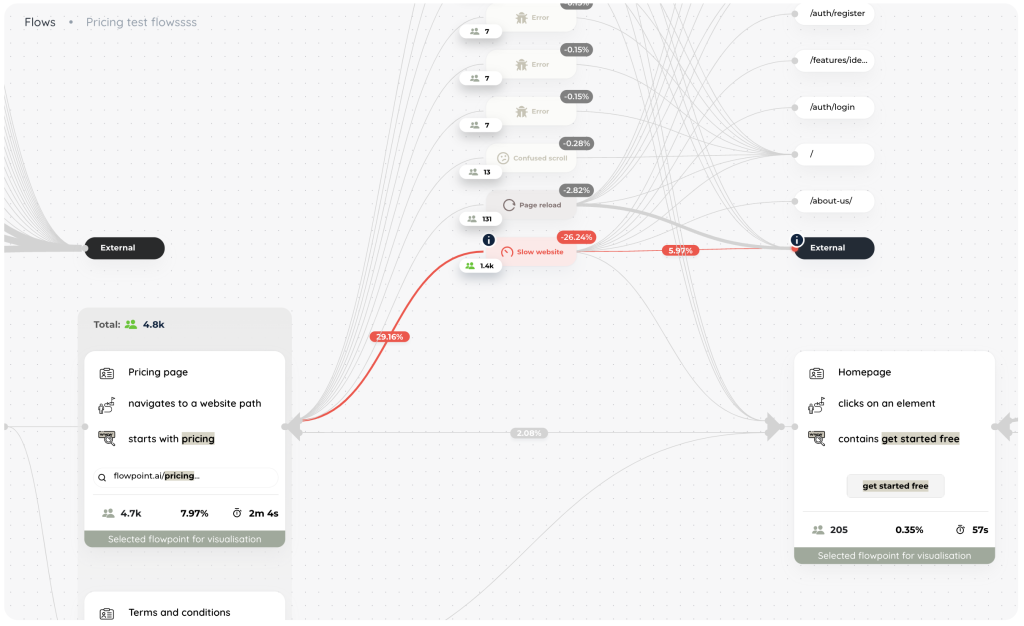
Here’s how it unfolds: on the Page Exploration page, you're presented with a visual map of your website’s traffic. Each page is a node, a stop in the user's journey. You select these nodes, one by one, tracing the path from where users typically start to where they finish. This process is intuitive—no coding, no complex setups. Just a few clicks and you have a user flow mapped out. It's web analytics reimagined, tailored to be the world’s easiest method of identifying and creating user flows.
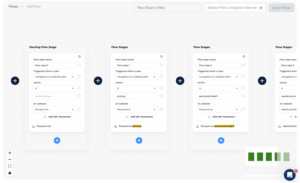
But there's more magic to this visual wonder. With such visualizations, creating a conversion funnel becomes a breeze. For the uninitiated, this funnel represents the journey a visitor takes, right from awareness to action. So, if you were wondering why a certain path isn't converting as expected, this graph is your starting point to diagnosing the problem.
Other Potential Use Cases:
-
Content Strategy: By understanding which content pieces are the most visited, you can tailor your future content accordingly.
-
User Experience (UX) Enhancement: Identify dead-ends or confusing navigation elements and rectify them to ensure smooth user journeys.
-
Marketing Campaign Analysis: Did that recent marketing campaign work? The traffic patterns will tell you.
-
Competitive Analysis: By comparing your traffic visualization with competitors, you can gain insights into potential areas of improvement.
Check out this short video for more infos:
Join the Revolution with Flowpoint.ai
The world of website analytics is evolving, and being stuck in the past isn't an option. Visualization, as offered by Flowpoint.ai, is transforming how we perceive and utilize data. It's not just about numbers anymore; it's about understanding, insights, and impactful actions.
Flowpoint's newest visualization feature is ready to set your analytics game a notch higher. If you're ready to see your website traffic like never before, sign up on our dashboard now (opens in a new tab).
To the marketing professionals and business owners reading this: The future is visual. Are you onboard?